A visual ode to China's biggest metropolis.
This article was originally published on Neocha and is republished with permission.
Twenty-six million and going strong, Shanghai is a sprawling metropolis where tradition and modernity coexist. Its residents, old and young, locals and outsiders, share a frantic pace of life, each with a take of what the city means to them.
Seven years after moving to the city, French creative director Benoit Petrus still has the same sensation he had the first day. “It’s the feeling of a constant flow of energy and movement. That’s what makes this city so unique,” he says. When he arrived, it surprised him to find a leafy city, a more bucolic scenery than the dense urban landscape he was expecting. To this date, he’s still fascinated by how the trees form a canopy over some streets, especially in the Xuhui district. If he were to illustrate a magazine cover celebrating the city, that would be the sight he’d choose.
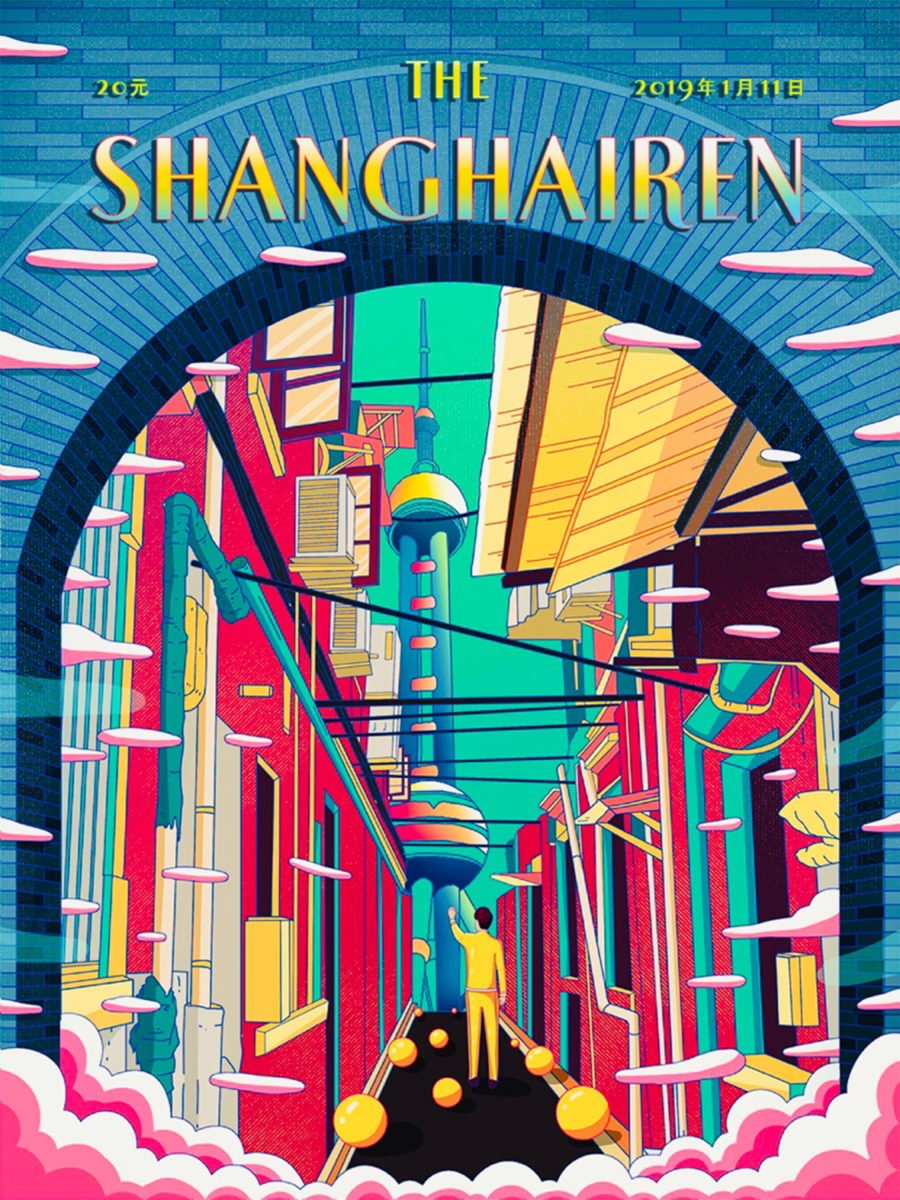
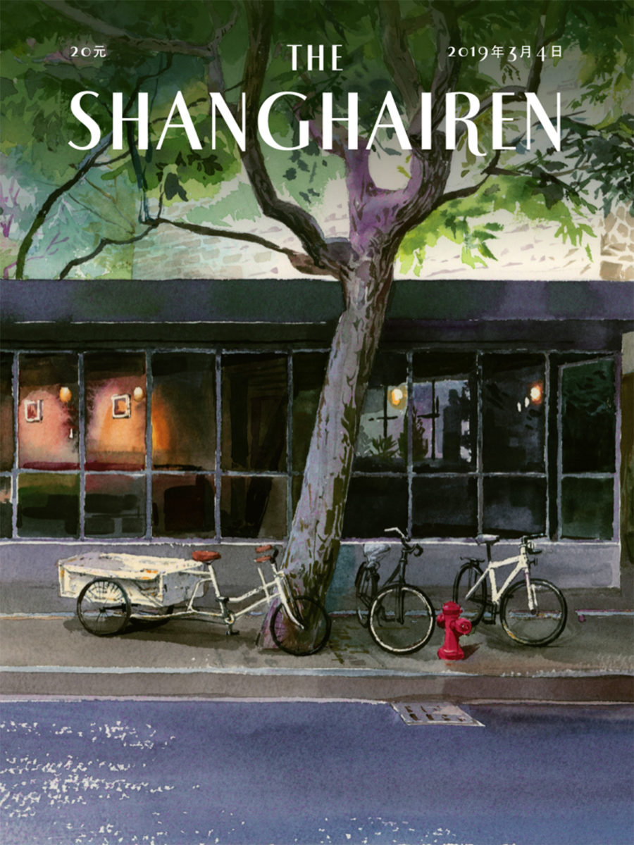
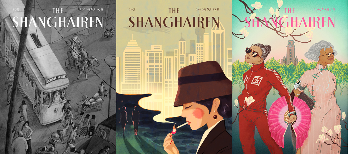
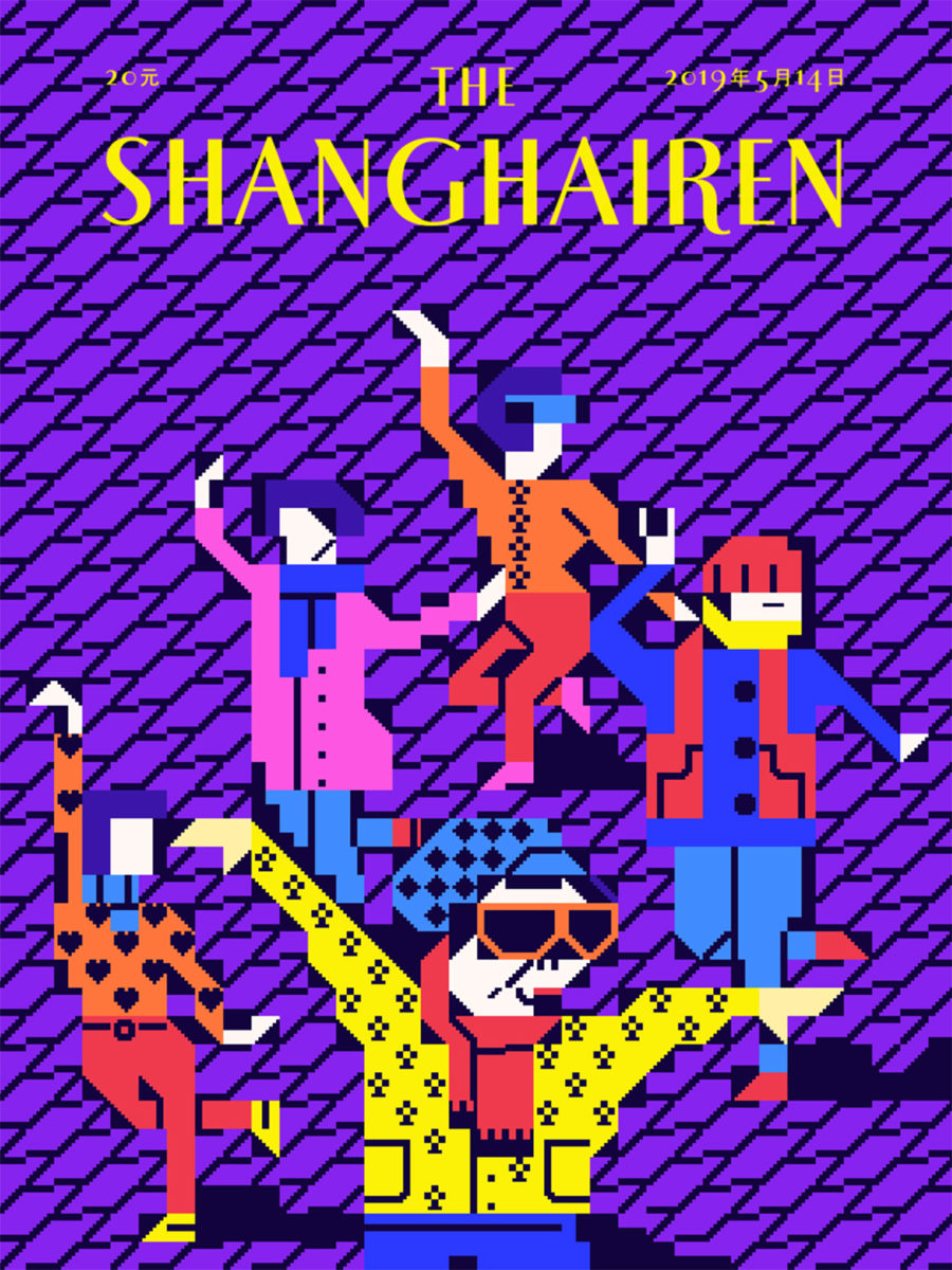
However, instead of creating his own magazine cover, Petrus invited other creatives to do so. He asked artists, illustrators, and designers who hold a special bond with the city to draw their “Shanghai moment” as a single cover page with the title The Shanghairen. Over eighty covers later, in early 2021, Petrus published a book, a fine-binding anthology of all covers up to now. It’s an ode from creative souls to the city that breeds them.
The idea of The Shanghairen came to Petrus when he discovered The Tokyoiter, which follows the same concept but pays tribute to the Japanese capital. As Petrus found out, there was also The Parisiener, the first of the sorts to appear in 2012. It was followed by Le Montréaler and then The Tokyoiter. “I was mind blown by the concept. My immediate reaction was, why not do it for Shanghai?” he says.
Different versions of this simple concept have also popped up in other parts of the world. Sometimes it’s an initiative that comes from a single designer, and sometimes it’s a larger group project. The Bangkokian, The Brusseler, The Petersburger… All independent from each other, yet identical in essence—inspired by the artful covers of The New Yorker.
As the idea grew, Petrus couldn’t stop wondering what stories the artists would develop to express their feelings for Shanghai. While talking to them, his briefing was minimal: they were tasked with creating their “Shanghai moment,” which he defines as something original and unique to the city. “I could have suggested interesting topics since there’s so much to tell about this city. But it’s more fun to let them surprise you. They’re making art, so I don’t interfere,” he says.
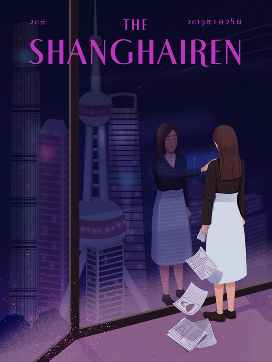
The first cover came out in January 2019, created by illustrator Ju Lin who’s actually a Beijinger. She depicted a woman looking at her spectral reflection on the window with the night sky falling over Pudong’s barely lit skyscrapers. It’s an allegory to the often excruciating working hours and irregular shifts far too common due to the city’s relentless business activity.
The Shanghairen gained recognition in design and illustration circles. Petrus, who actively had to scout for artists to design covers at first, now receives submissions regularly. They come from everywhere in China, and sometimes from abroad. It’s a mixed assemblage that includes foreigners who live in Shanghai and Chinese expats, reflecting Shanghai’s diverse creative community and population, constantly in flux.
“Most of the artists we feature are Chinese and based in Shanghai,” Petrus says. “Although, they’re not always Shanghainese. We’ve featured Chinese artists who study or work in the UK, US, and Europe. There are also people living in other major cities in China, such as Beijing, Chengdu, Nanjing. A few foreign artists are now living in different countries around the world too, after having lived in Shanghai.”
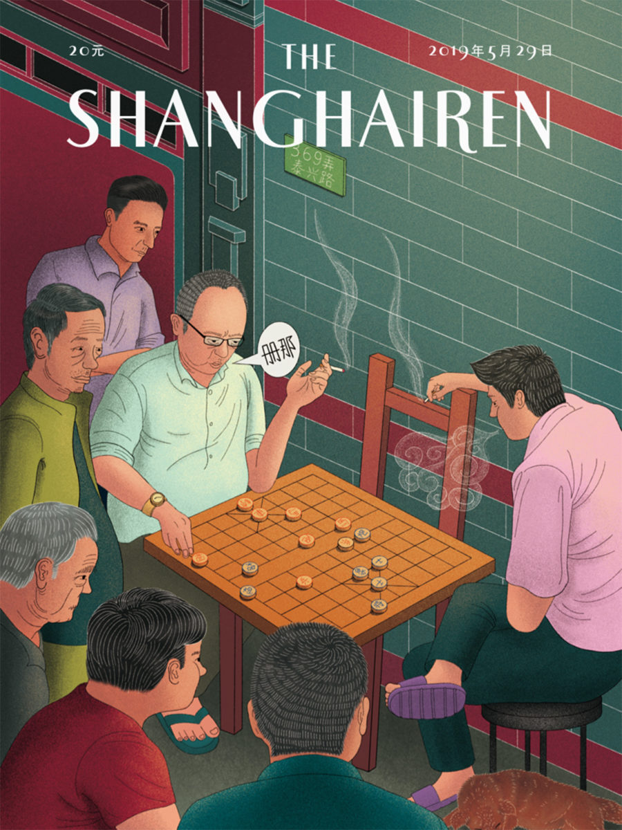
Freelance illustrator Bowen Tan reflected on his childhood memories to create his cover. He depicted men playing xiangqi, or Chinese chess, a common sight in Shanghai. “Not everyone in the group would focus on the game,” Tan says. “Some of them prefer to chat about their lives. Others would stay quiet and just smoke.” Tan points out that gathering around a xiangqi board is a priceless moment to these men, a temporary escape from their domestic and work lives. Touchingly, he includes his own father in the picture, who had passed away a few years before.
Similarly, Italian designer Ailadi expressed her amusement while seeing the relationship that Shanghai residents have with public spaces. “Two chairs and one box are enough for people in Shanghai to sip tea while playing cards or chess as if they were at the seaside. A street corner or a square is perfect for them to dance together to the sound of traditional music, tango, or macarena,” she says.
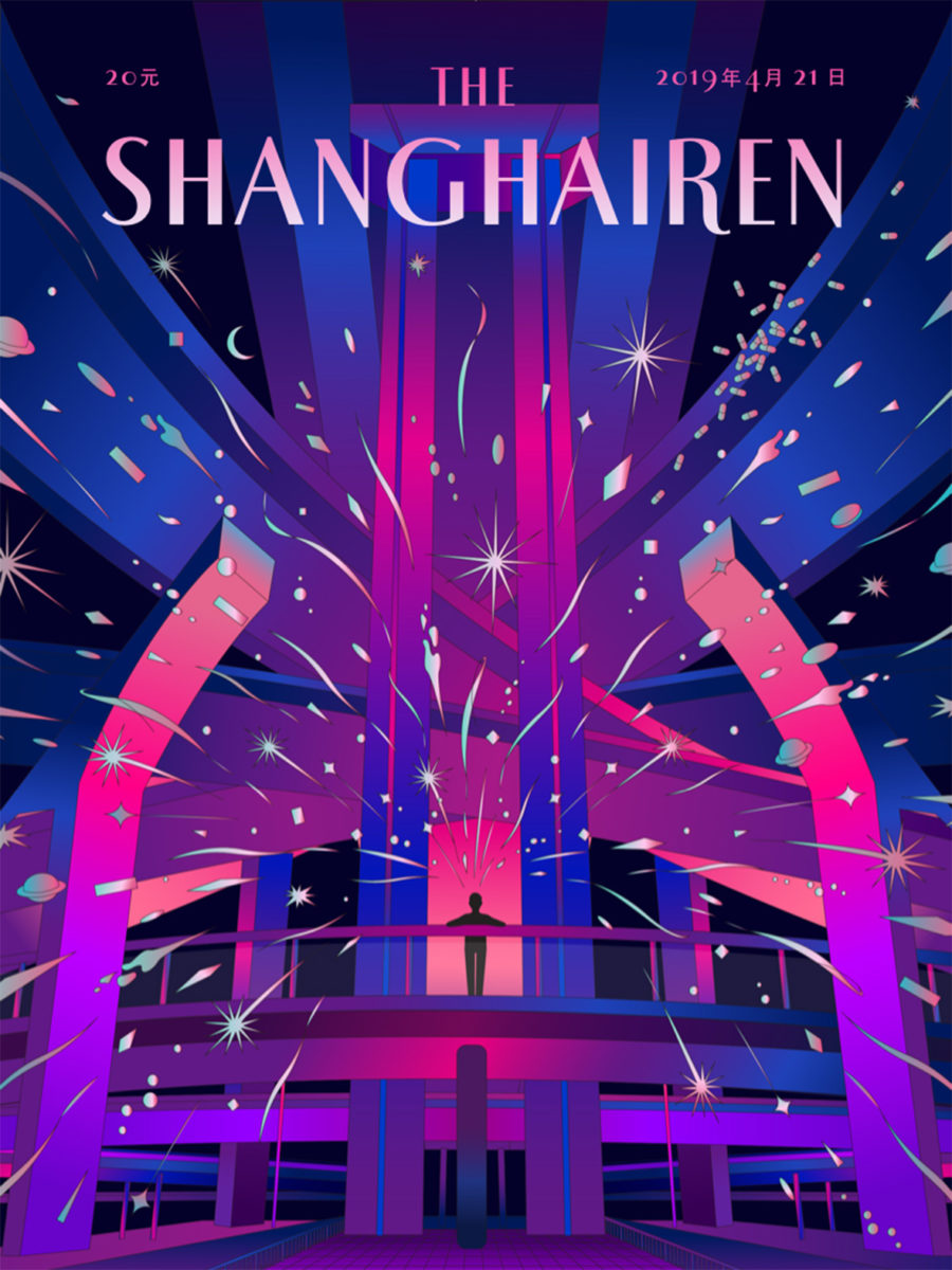
Shane Li depicted an elevated highway in Shanghai commonly illuminated with neon lights to express the city’s essence. “These stunning structures are like blood vessels of this fast-paced and dynamic city,” he says.
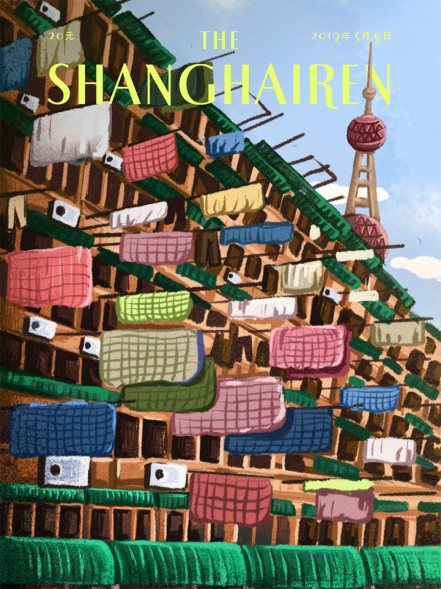
Intimacy is a constant in the megacity. Changxin Lee‘s Shanghai moment reflects his experience living in one of Shanghai’s traditional alleyways, where, when the sun is out, there’s always laundry hanging up in public. Trousers, shirts, socks, underwear, blankets, sheets, and shoes.
Perhaps the dish best associated with Shanghai is the xiaolongbao, a steamed bun that’s more like a sack of soup. It almost requires technique to be eaten. Sometimes, when you bite it, boiling soup spills everywhere. That’s what illustrator Peter Zhang used for his Shanghai moment. “As a fan of xiaolongbao, I’ve had countless embarrassing and messy situations. My cover captures the moment when you take a bite of it, half nervous about the mess; half excited for the delicious taste to come,” he says.
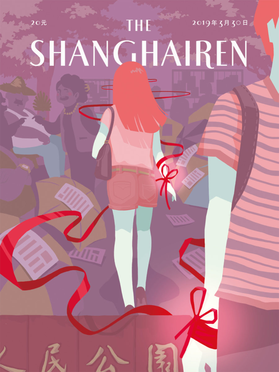
From Hangzhou, Karen Yao depicts the infamous marriage market of People’s Square Park. There, elderly parents gather to find spouses for their unmarried children. “Often, marriage here is not based on love,” she explains. “Age, income, education levels, and other similar aspects are more important.” In the market, parents advertise their children, highlighting, beyond their physical attributes, their monthly salary, what car they drive, and their housing conditions. Her cover expresses the dichotomy of modern Shanghai, where traditional values are still predominant in love and marriage.

As covers piled up, Petrus noticed recurrent elements. Some iconic ones: the Pearl Tower, the qipao, the yulan magnolia. But one thing was particularly noticeable. “I found that most illustrators chose to depict women as their cover hero; men have smaller roles,” he says.
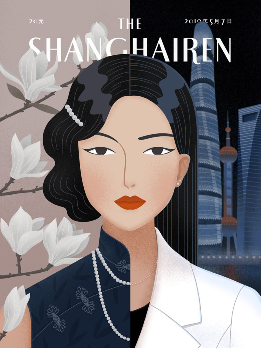
The cover that he chose for the book is an illustration by Xin Yin, also from Hangzhou. It’s the bipartite representation of a young woman. On one side, she wears a qipao, a pearl necklace, and short waved hair in the 1920s style. In the background, the magnolia flower, a symbol of elegance and gentleness. This side represents the golden age of Shanghai, a cosmopolitan city at the forefront of design, fashion, and architecture. On the other side, she wears a white business suit and her hair straight and long. In the background, the skyline of Pudong, the symbol of China’s financial powerhouse. The woman gazes back at us placidly, resolute, empowered—as the multifaceted old city itself.
