This article was originally published on Neocha and is republished with permission.
With music recording unbound from physical restrictions and floating around the digital ether, what good is a cool CD case or liner notes? If today’s vinyl craze is any indication, people still value that physical connection. Creating album packaging is still Taiwanese designer Wu Jianlong’s main area of work, and considerations to their tactility is front and center in his designs. Even though nobody really buys physical CDs anymore, they still have their merits: “Physical albums are like business cards for musicians,” he says. As valuable as these are in themselves as art objects, he’s taken what he’s learned with album design, expanding into poster art and even sculptural pieces using similar materials and aesthetics.
It was music and movies that inspired Wu to become a designer. “Browsing the racks at music and video shops to soak in the cover designs—this deeply influenced me.”
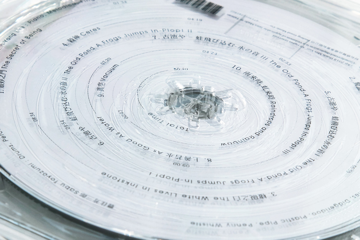
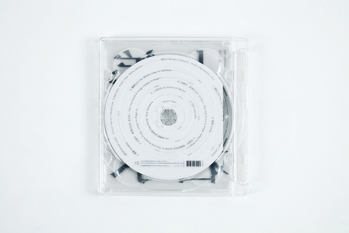
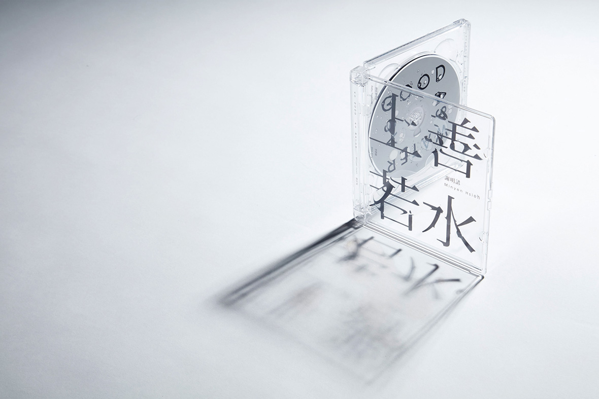
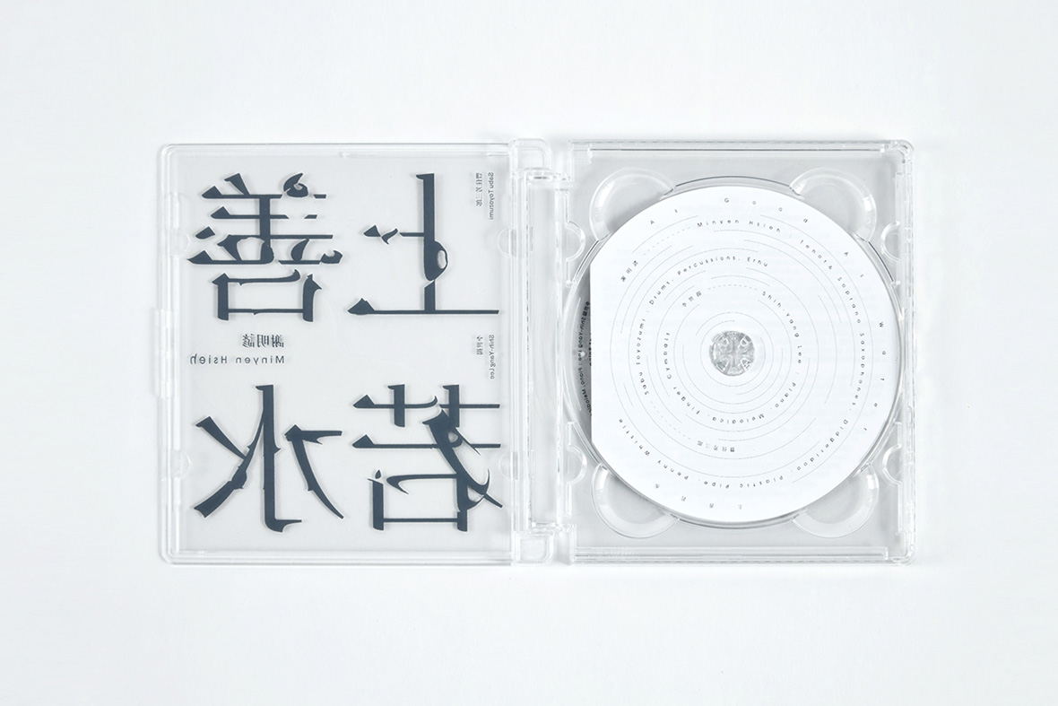
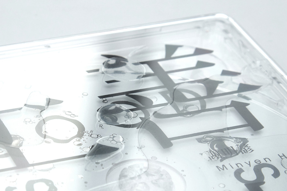
The physical qualities of jewel cases and CDs are clear starting points for Wu. Literally. He excels in his use of translucency and returns to it frequently. His design for Taiwanese saxophonist Minyen Hsieh’s As Good As Water plays on the album’s theme of water, which has been visualized as puddles and droplets that seem to sit atop the see-through case. The artificial fluids distort the text beneath, just as real water would.

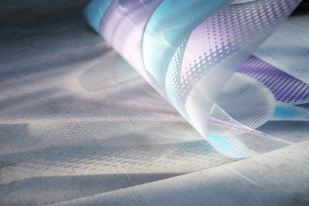
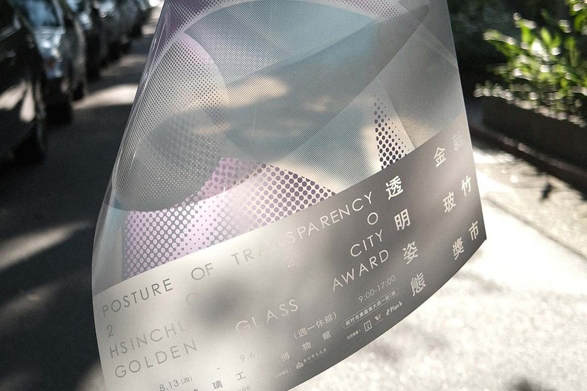
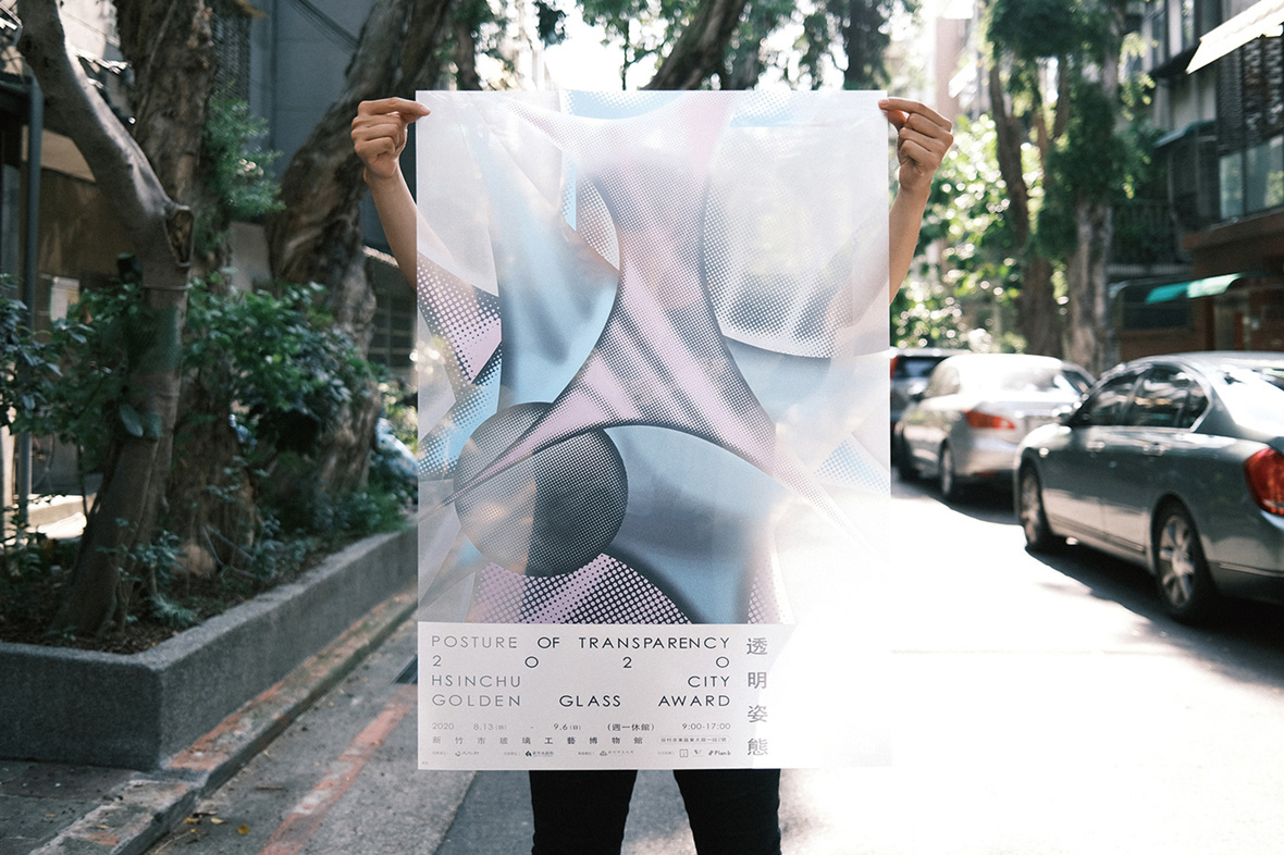
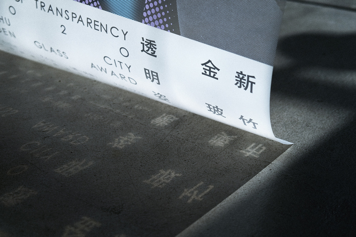
His poster for Posture of Transparency, a glass-art exhibition held in Hsinchu, is also translucent, printed atop a material that allows light to partially pass through: “Transparency is an illusion; sometimes it might be transparent like a liquid, other times it might be like plastic,” he says. “You can add a sense of layers with transparent materials.”
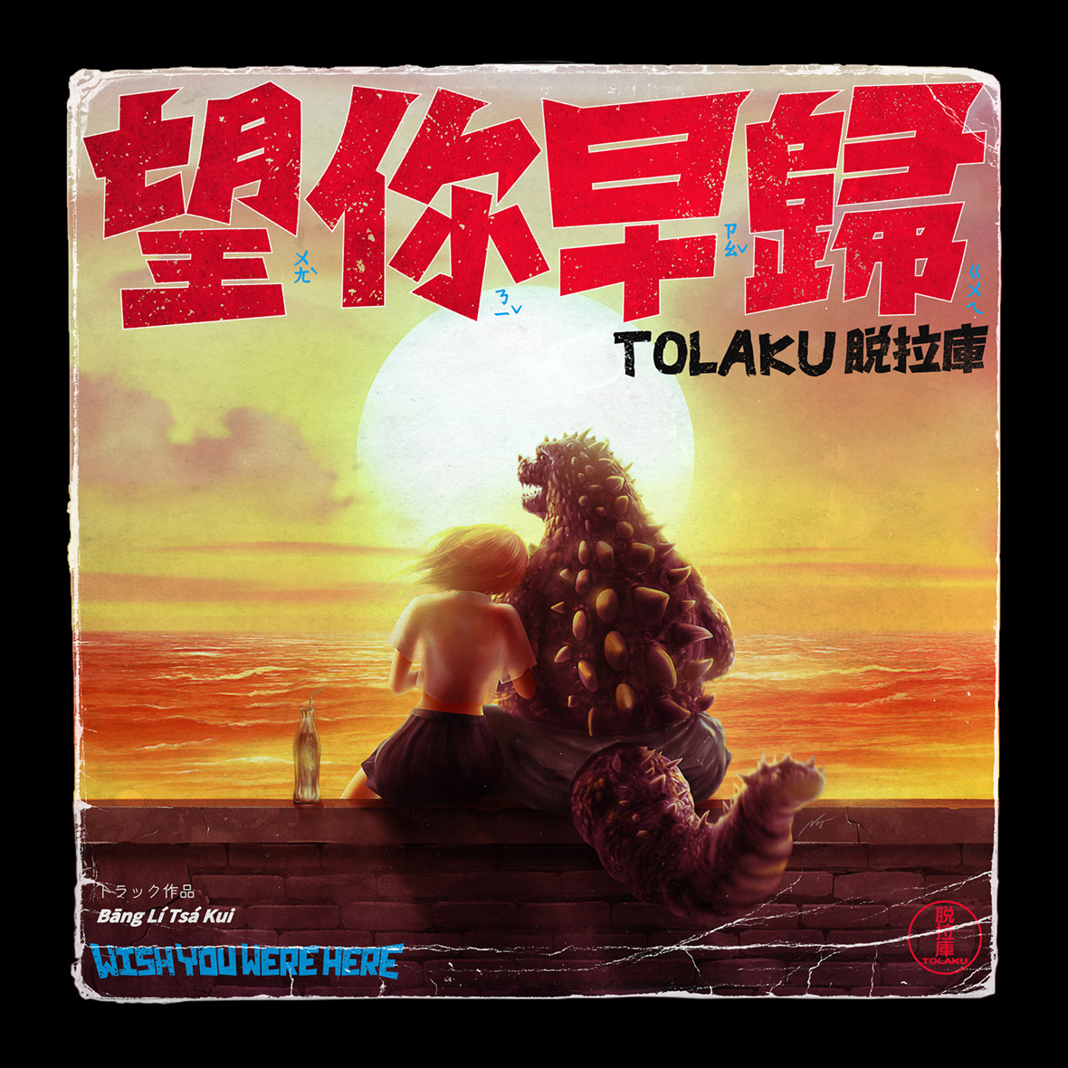
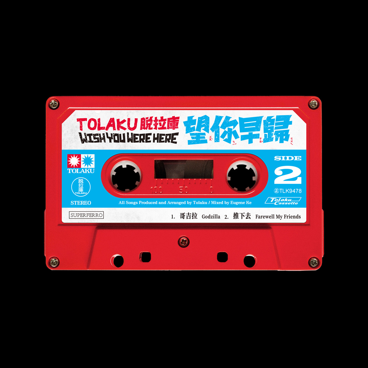
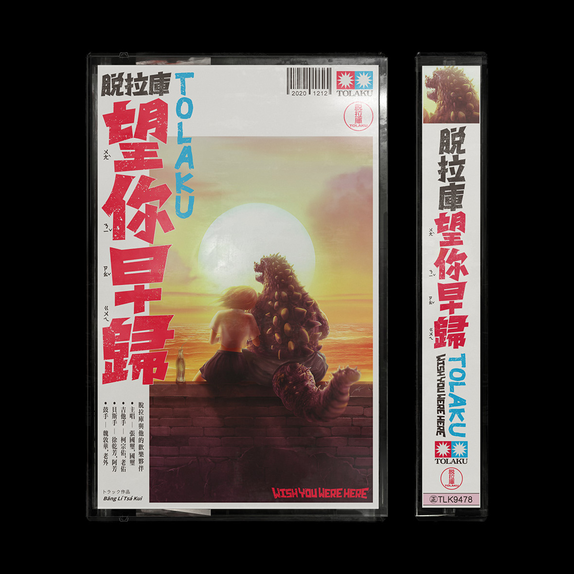
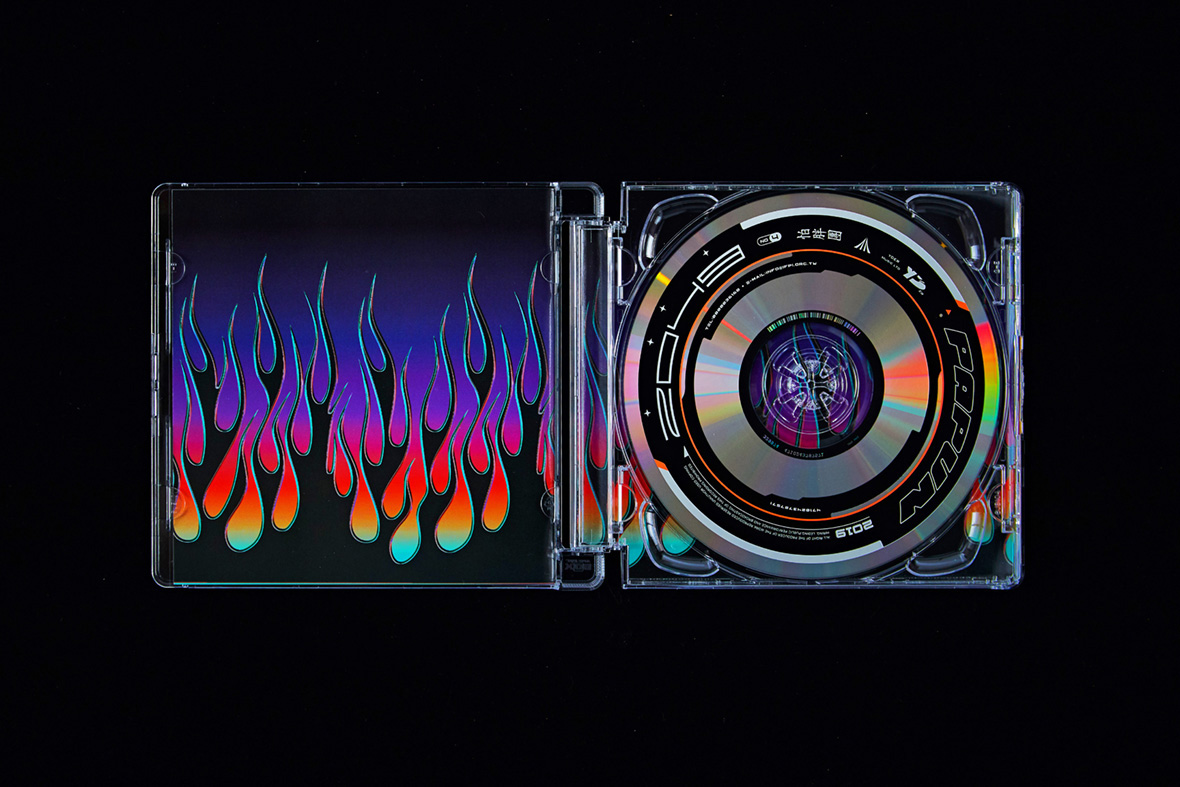
Wu’s love of retro sci-fi is also front and center in his work. The typeface and artwork for pop singer Tolaku’s release of his album Wish You Were Here is a direct reference to early Godzilla films. For rock band Papun’s album 2049, he features a customized Delorean from Back To The Future. But modern science fiction also serves as creative fodder, and he cites it as being foundational to the metallic aesthetic he’s known for. “The weapons that characters used in sci-fi and the general futuristic aesthetic of those movies, all of that still influences my work today,” he says. “I also think the material just looks dope.”
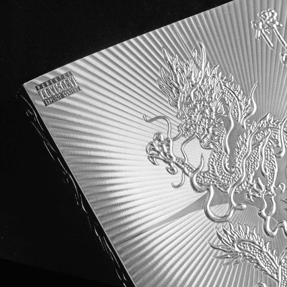
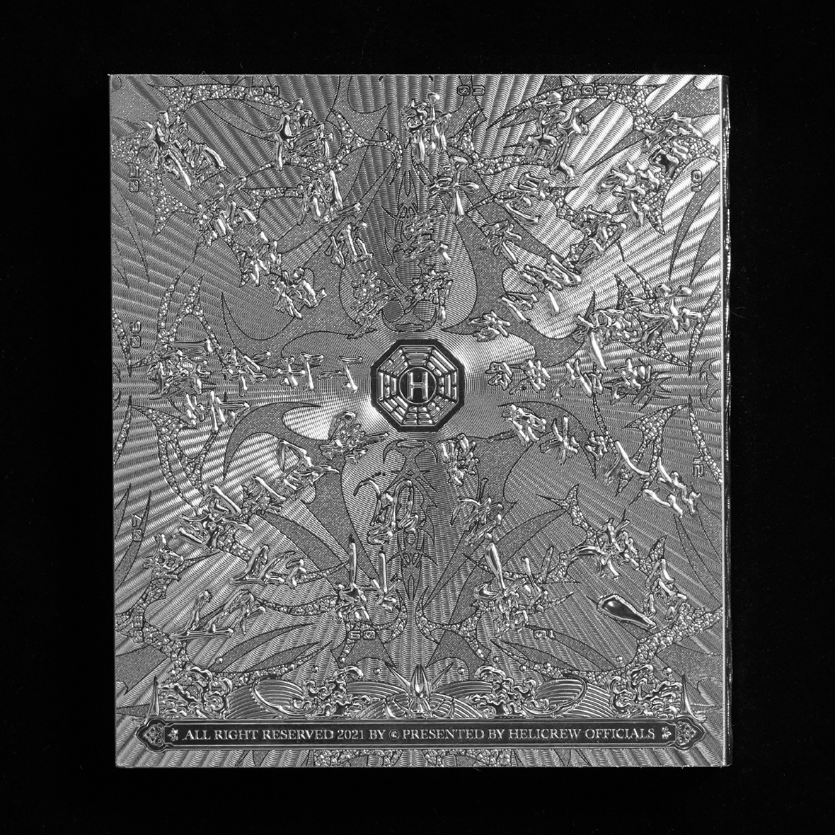
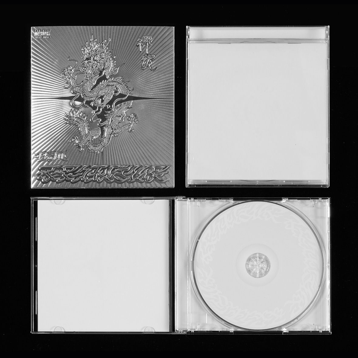
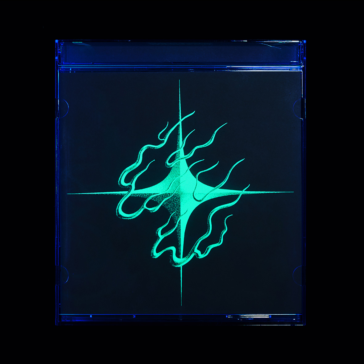
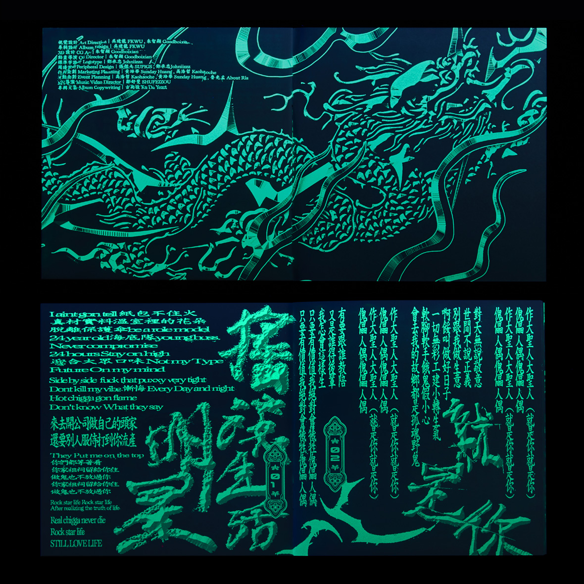
The metal-inspired designs are some of Wu’s most distinct works to date. His latest album design for rapper K-how’s Zenwave is an embossed foil cover that looks like an artifact straight from the future. (He uses UV ink on the inside as well.) When viewed online, it almost resembles CGI.
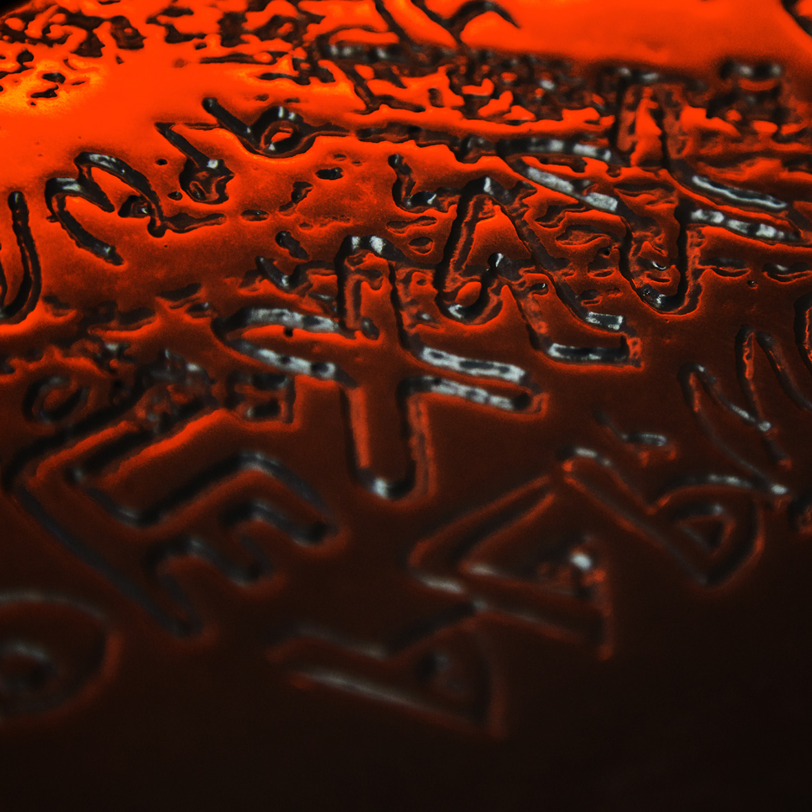
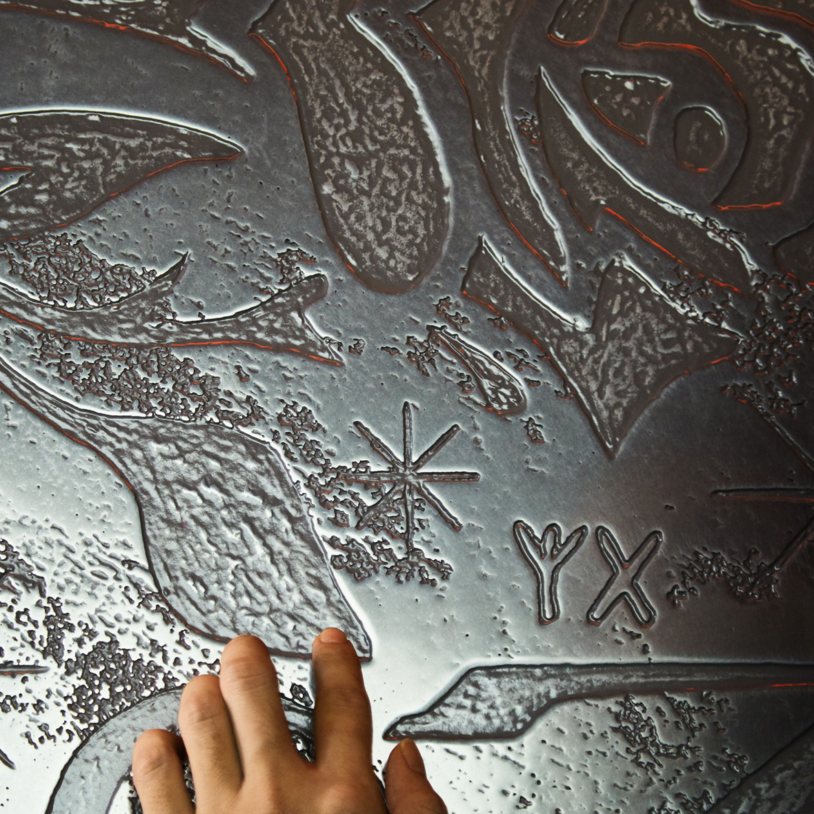
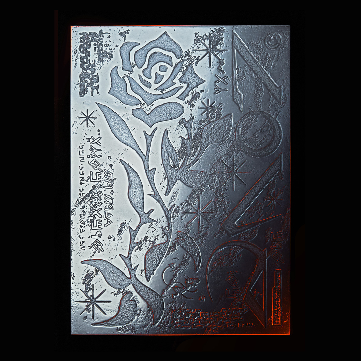
The piece Wu had manufactured for an exhibit at P_L_A_C_E gallery is his most ambitious metallic design to date. He created a three-foot-tall embossed metal sheet that gleams brightly, and it and had to be mechanically lifted to the upper floor where it was hung. “The theme for that show was to depict utopia, which for me is love,” he says. “I used metal to portray my idea of love.” Although seemingly cold in regular light, passion exudes under the warm, red light he chose to display it under. His piece builds on the lessons learned from past album designs and elevates these devices to new heights.
Wu’s work continuously builds on the past, a testament to the fact that dated mediums and techniques shouldn’t be considered any less relevant just because technology has moved on—they just need to be reimagined.
Instagram: @fkkwu
Contributor: Mike Steyels
Chinese Translation: Alice Zhang